Com.unity
Helping cities organize help
Com.unity is the third and last project born out of the Google UX Design Certificate Program, the first one being 3sixty and the second one being Calypso.
The goal of the project was to design a social good mobile and web app.
I chose to design a tool for cities to ensure that everyone has food and shelter. What if people in need in our city could be helped with a better organization and less waste of food, free spaces and free time?
This wicked problem cannot be solved with pure logistics but what if we could at least ease a bit the life of our neighbors in need?
Problem
The users of the app are people living in a city who want to help, people working for a city who will organize help, and people living in a city who need help. Depending on their situation, a given user who needs help can also help and vice-versa.
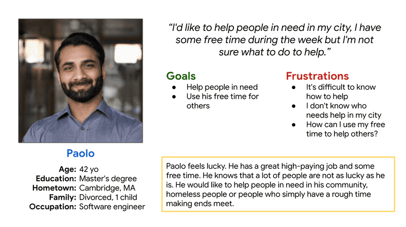
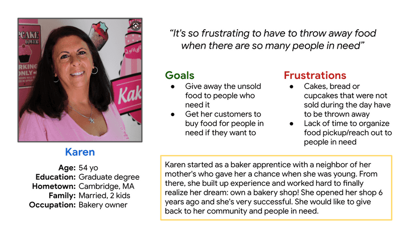
The problem is quite complex and in the scope of the Google UX Design Certificate Program, I decided to focus on 2 groups of users:
We can help our neighbors in a lot of different ways. I chose to only focus on two groups of users:
- Users who want to help during their free time and make good use of the resources they feel lucky ot have, like Paolo:
- Users who own a food business and hate to see unsold food thrown away when their neighbors are food insecure:
Design
Competitive audit
I conducted a competitive audit on 3 direct competitors:
- Olio: a food-sharing platform, connecting people with neighbors and local shops all over the world
- 412 Food Rescue who connects users with nonprofits who serve those who are food insecure
- Shelter App who helps homeless and low-income families connect to services and resources using web and mobile app platforms
The competitive audit allowed me to see what the competitors do well and what can be improved.
Some gaps I identified include:
- The desktop version, when it exists, is not responsive enough
- Apps do not support businesses as users
- People in need cannot ask for what they need
- Cities are completely out of the picture, nonprofits and charities are the ones who help people in need
Some opportunities I identified include:
- Make the app and website responsive
- Include cities, businesses, and people in need
- Develop a strong brand identity that is consistent between desktop and mobile
- The app on mobile should use more mobile features such as localization, pictures, phone calls, or offline download for later use.
Exploration of ideas
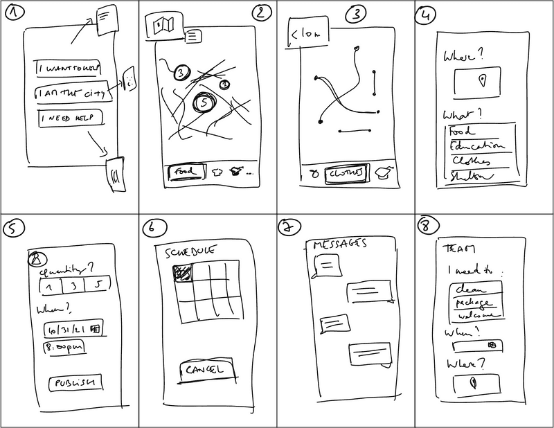
Then, it was time to come up with a LOT of ideas. I applied the Crazy 8 technique.
- The same app can have very different users: people who wants to help, people who work for the city and manage the app, and people who need help. A very simple menu allows them to switch from one use to another.
- On a mobile, a map with all the volunteer missions around the user or places where the user can get free food or other resources could be very useful
- The users can filter the results with relevant options such as the length in miles of the volunteer mission, or how far the charities or nonprofits are from the user, when they are open, etc
- The app could allow users to let the city know what they need, anonymously. A kind of way for people working for the city to take a pulse of an area
- A user can create listings if they have something to give away. The listing will then go through the city and after validation, it will turn into a volunteer mission pushed to the app: go pick up the item and drop it off at this location
- A user can sync their calendar in the app so only the volunteer missions matching their free time are proposed and then added to their calendar for an easy scheduling
- Users can message each other, for instance a volunteer who has to pick up free food and the business owner giving away food
- Users can also create and join a volunteer team: a business owner giving away food may need a team of volunteers to pack food, pick up food, etc
Wireframing
Paper wireframing allowed me to explore multiple ideas in a cheap and fast way and I kept the best elements from the sketches and port the wireframes digitally in Adobe XD.
I had already created a library in Adobe XD with icons, pictures, colors and character styles for wireframing so I can create wireframes pretty quickly now.
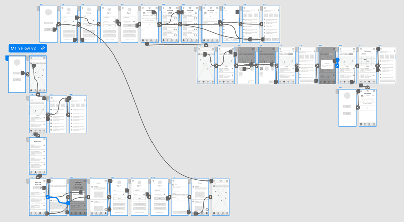
I identified multiple problems in a usability study conducted on 4 participants. I solved those problems in a second version of the low-fidelity prototype.
Click on the following screenshot to access the low-fidelity prototype modified after the usability study:
Sitemap
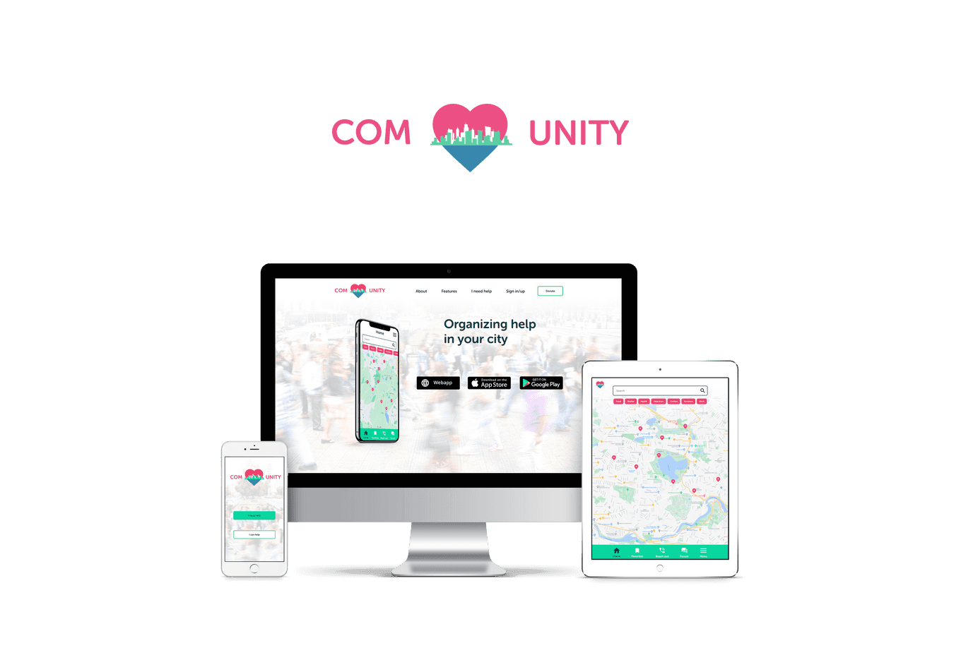
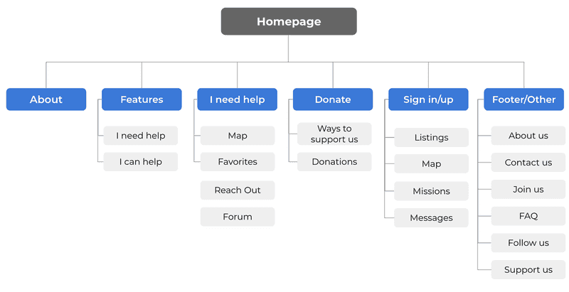
I designed the app for mobile, tablet and desktop. If people don't have a smartphone, they can still use the app on a computer at the library, etc. They can also prefer to use a computer because some tasks might be easier (browsing listings, etc).
I chose a hierarchical website structure: the homepage presents the app, its features and gives entry points to the users.
Outcome
Here are recordings of the website created for the app.
Web app on desktop
Web app on mobile
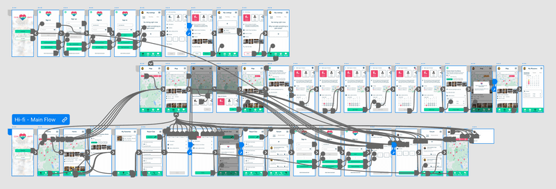
Click on the following screenshot to access the high-fidelity prototype of the app on mobile:
Reflection
Project after project, I could streamline my work. The design thinking process is now perfectly integrated. I also put in place components in Adobe XD to speed up the digital wireframing.
During this project, I learned a lot about the importance of the 4 C's:
- Complementarity: devices can interact with each other within the app in order for the user to have a better overall experience.
- Context: it's important to understand on which device the users will use the app to design an experience that matches their needs on a specific device.
- Consistency: design is consistent across the different devices so the users are not lost.
- Continuity: users can save places to their favorites on desktop and go to those places later using their smartphone GPS for instance. A listing can be saved as draft on desktop and published later on a smartphone after the user took pictures of the listing's object, etc
