Calypso
Welcome to Paradise!
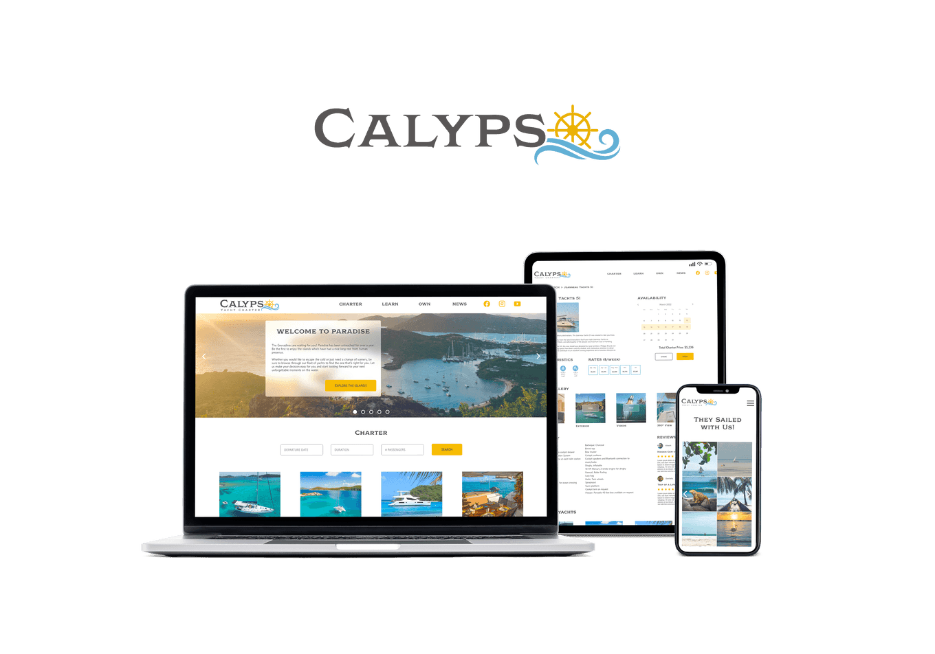
Calypso is the second project born out of the Google UX Design Certificate Program, the first one being 3sixty.
The goal of the project was to design a responsive website.
When I had to choose the design prompt, I must be honest here: I live in Boston, summer was coming to an end which automatically means that "winter is coming" and I was not ready for that. I decided to design a responsive website for a yacht charter company based in the Caribbean Sea...
It was also the opportunity for me to focus on a commonly flawed user experience with numerous user pain points: the booking flow.
Problem
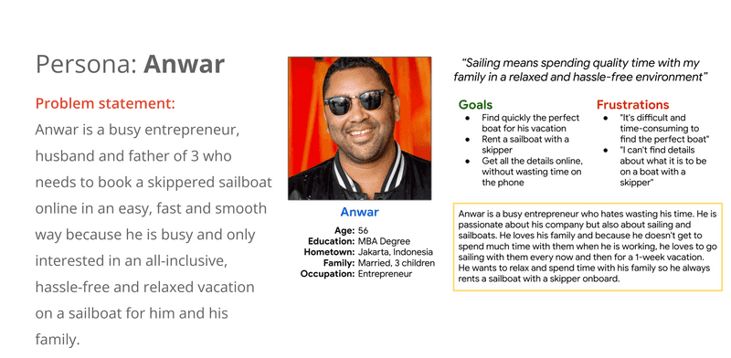
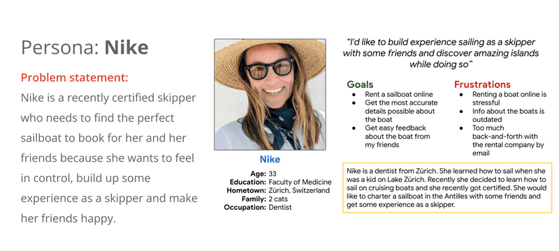
Users visiting a yacht charter company want to book a vacation on a boat. However their needs can be quite different. I chose to focus on two groups of users:
- Users who want to book an all-inclusive and hassle-free vacation on a boat like Anwar:
- Users who want to charter a boat and gain experience as a skipper like Nike:
Design
Competitive audit
I conducted a competitive audit on 2 direct competitors:
- Dream Yacht Charter: a big yacht charter company operating worldwide with a diverse fleet that suits any sailor
- The Moorings: another big yacht charter company who offers a loyalty rewards program
and 2 indirect competitors:
- Jeanneau: a boat designer, builder and dealer who specializes in performant cruising yachts
- Cruise America: a Recreational Vehicle (RV) rental company
The competitive audit allowed me to see what the competitors do well and what can be improved.
Some gaps I identified include:
- Responsive web design and accessibility
- Usability of search feature
- No comparison feature offered by the direct competitors
Some opportunities I identified include:
- Create fully responsive design
- Provide an easy search
- Support social media pictures and user reviews
- Provide inspirational tone and pictures
- Offer the possibility to compare boats to help decision making
- Add rental options to the booking flow
- Explain fees
Exploration of ideas
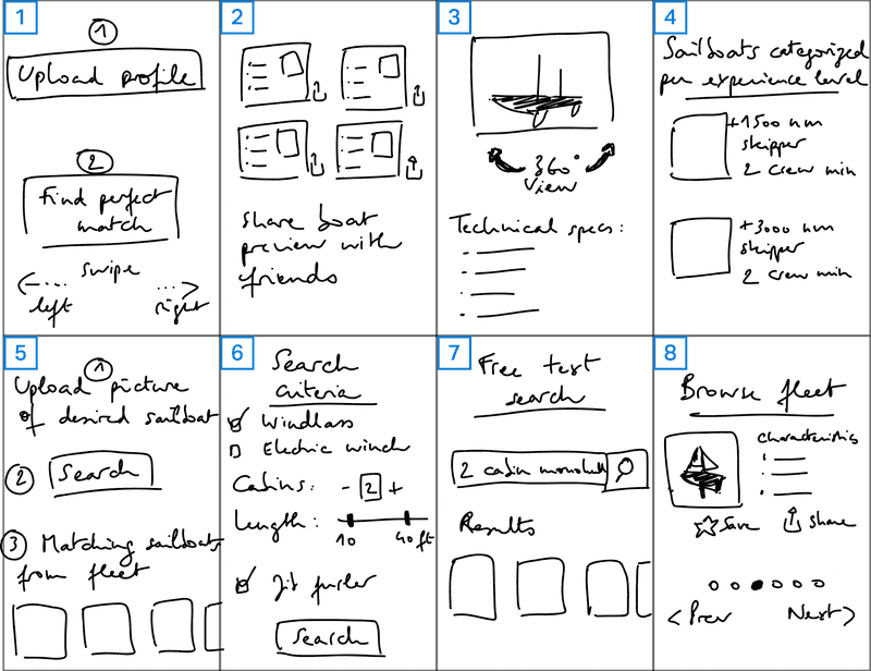
From there, I flexed a bit my creative muscle with the How Might We? and the Crazy 8 ideation techniques.
- The user creates their profile with their experience, certifications and a list of their preferred sailboats if any. Then the website tries to find the best matches among the list of yachts available with the yacht charter company. The user swipes left (rejects) or right (adds to their list of faves).
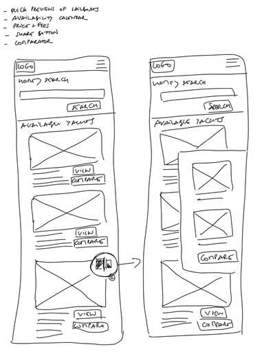
- Quick previews of sailboats with all the needed info at a glance. The user can then quickly share a preview (link to the preview card) with friends or family to get their feedback.
- Each sailboat has a 360 view of the interior and exterior so the users can really visit the boat and make a more informed decision.
- The sailboats of the fleet are categorized by experience level so the user knows which category is better suited for their qualification.
- Search based on a picture. The user uploads the picture of their dream sailboat and the web app then lists the best matches from the company's fleet.
- Search with criteria. The user is presented with a simple or advanced search. In the advanced search, they can select the criteria they are looking for.
- Free text search, a la Google. The user enters a sentence or keywords and the web app tries to find the best matches from the company's fleet.
- No search but a browsing feature where the user can see all the sailboats of the company's fleet with the important characteristics and pictures. They can quickly save for later or share with friends or family to get some feedback.
Sitemap
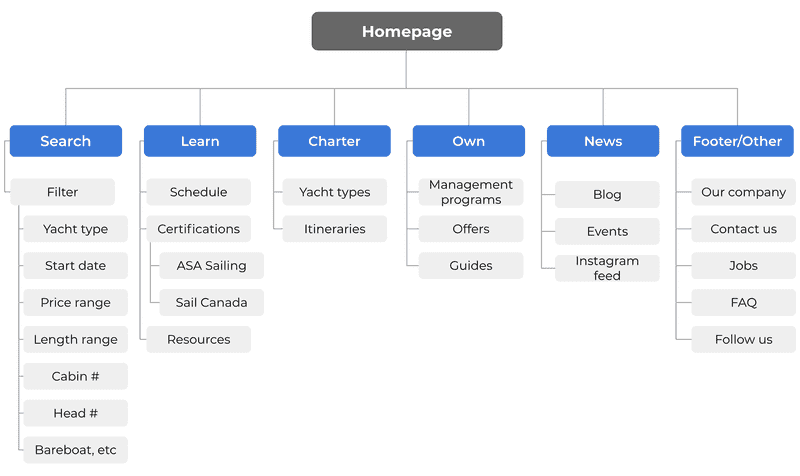
I chose a hierarchical website structure with very distinct sections corresponding to users' needs (search, learn, charter or own). Additional information can be found in the footer or second menu.
Wireframing
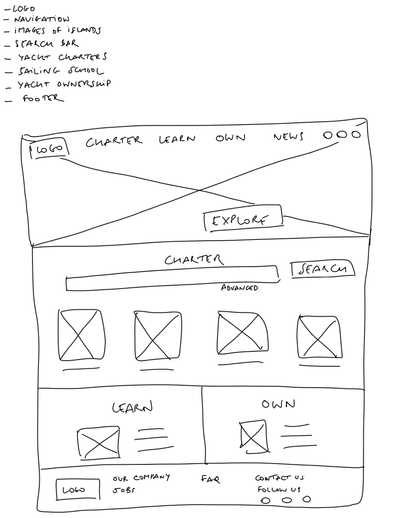
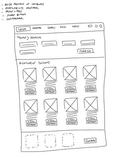
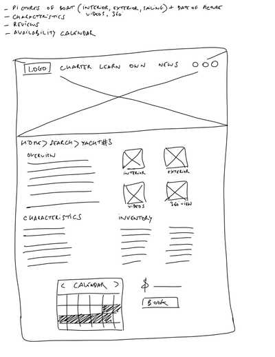
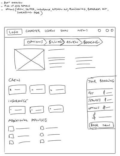
Paper wireframes allowed me to quickly explore plenty of ideas and refine by selecting the best elements out of each version.
Homepage
Search results
Boat details
Booking
I sketched out paper wireframes for both desktop and mobile in order to achieve a fully responsive design.
Search results (desktop version)
Search results (mobile version)
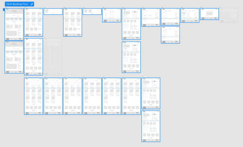
I then proceeded to port digitally the paper wireframes in Adobe XD, linked the different screens together and added interactions.
Click on the following screenshot to access the low-fidelity prototype:
Outcome
After a usability study conducted on the low-fidelity prototype and another one conducted on the high-fidelity prototype, improvements were brought to the initial design:
- Charter type filter option was added
- Filter options menu can be closed by clicking anywhere on the screen
- Yacht cannot be changed at the end of the booking flow to avoid a disrupted booking experience
- Booking call-to-action button is now above the fold on the boat details page
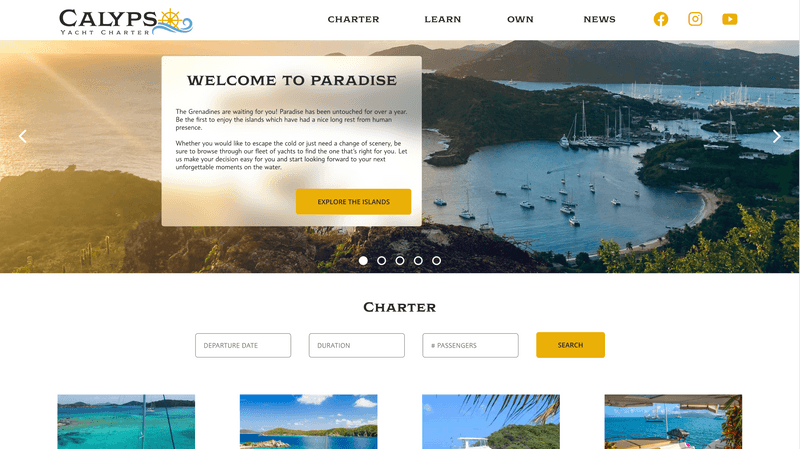
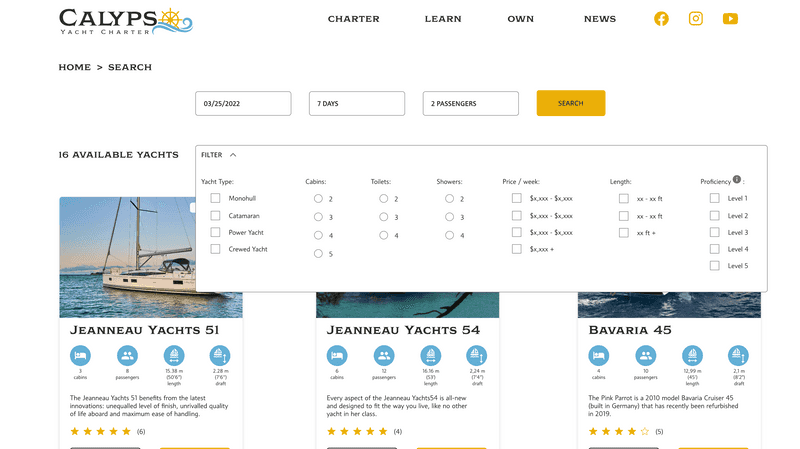
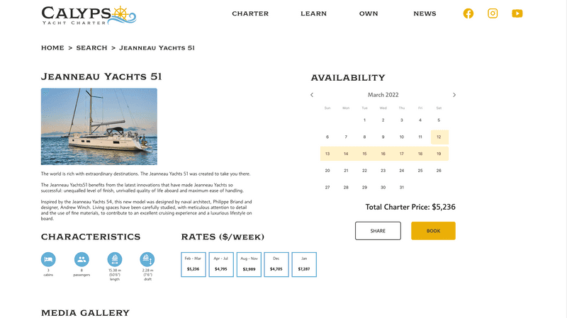
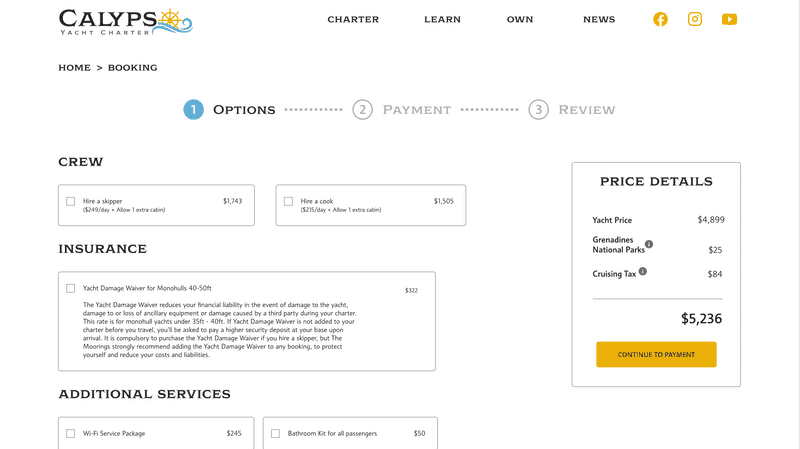
Here are some of the final mockups:
Homepage
Search results
Boat details
Booking
Click on the following screenshot to access the high-fidelity prototype:
Reflection
I enriched my knowledge of Adobe XD with this project: use of repeat grids and stacks, use of fancier transitions (overlay, slide-up and transitions between states of the same component)
During the design phase, I also learned about the different types of sitemap (hierarchical, sequential, matrix and database) and the importance of responsive design to really make the best of each device's screen size.
This second project of the Google UX Design Certificate Program was also a great opportunity to go through the whole design thinking process again and to really master the process and all the great tools and templates at my disposal.
