feamzy
Role:
UX Designer
Front-End Developer
Duration:
9 months
January 2021 - October 2021
Tools:
Adobe Illustrator/XD,
Atlassian, Slack, Gitlab
Languages/Frameworks:
HTML, Sass, TypeScript,
Angular, RxJS
Team: 5 people, 2 timezones
Helping parents help each other
feamzy is a social app for parents that helps them organize the life of their children and have support from a community of parents. As the saying goes, "it takes a village to raise a kid!".
The goal of this app is to reduce the mental load of parents so they can enjoy quality time with their family.
feamzy is a startup created in April 2020 by 3 cofounders based in France. When I started collaborating with them in January 2021, the team was also composed of a Full Stack Developer based in Tunisia.
The app is available in France on the Apple Store and Google Play Store since September 2021.
Problem
After the launch of the app in September 2021, the app analytics showed that:
- the number of users who signed up increased then reached a plateau after a few months
- only a small percentage of the users was active on the app
The whole challenge for us was to increase the number of users who signed up but also to have them use the app on a daily basis.
Hopping into a user's shoes
First thing first: define the problem. Why aren't the users returning to the app after they sign up? What are their pain points?
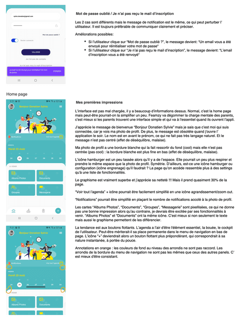
The first step in my investigation was a thorough review of the app with my pair of fresh eyes and also with my knowledge of the UX design best practices.
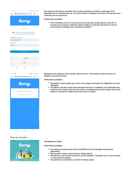
I listed all the bugs encountered along the way
as well as UX design problems
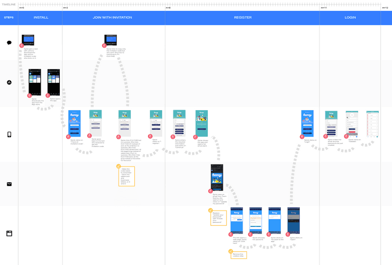
Then I created user journey maps for the main actions that a user must complete right after downloading the app: signing up, creating the profile of a child, sharing the app with other parents. By representing visually all the steps required to complete an action, problems really stand out.
Here's an example with the signup flow: a person who has been invited to download the app by a user has to interact with 5 different platforms/tools in order to sign up (text, app store, feamzy app, email client, web browser)!
User journey map: signing up
Pain points
Multiple pain points were identified during the research phase:
- The signup process requires too many steps
- The users have to do too many manual tasks before they can use the app
- Some bugs prevent users from achieving certain tasks
- Screens are cluttered
- Design is not consistent throughout the app
- The screens transition in inconsistent directions
- The users can share a link to download the app with other parents but cannot directly invite other parents to join a classroom they created in the app
Design
During the ideation, prototyping and testing phases, I worked on solving the identified problems for the users. This was achieved by applying UX design patterns but also thanks to competitive audits.
Ease the signup
Pain point
The signup process requires too many steps.
Solution
The signup process requiring too many steps was simplified thanks to a different method for creating a password which does not require to quit the app to go to a website then one's email.
Signup made easy
Get the user all set
Pain point
The users have to do too many manual tasks before they can use the app.
Solution
The app has very little interest if the user doesn't create profiles for their children and assign them to a classroom. Those extra steps who require the user to fill out forms are a bit too much to ask for a user who already went through the registration process. One way of fixing this was to design an onboarding process with a sequential structure. We decided to design and code a chatbot for that: the user is guided, gives all the information required sequentially as if conversing with a friend and at the end, the user is ready to go!
Onboarding flow at first launch
Fix the bugs
Pain point
Some bugs prevent users from achieving certain tasks.
Solution
A badly designed user experience can explain why users are not using an app as they should but bugs are ALWAYS a very very bad experience for users and a bad look for the app. All the bugs identified were added in our backlog and prioritized accordingly to their impact on the UX.
Keep it simple stupid
Pain point
Screens are cluttered.
Solution
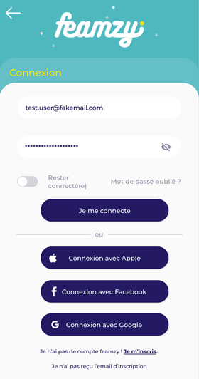
I then proceeded to declutter each screen by applying some best practices: white space, visual hierarchy using text size and weight, Gestalt principles (mostly common region), making important elements bigger, reusing conventions and standards (icons)
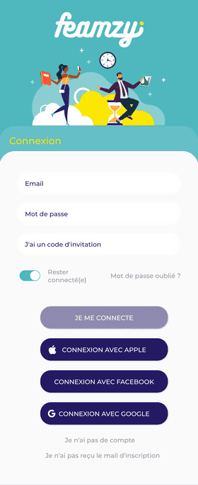
Landing page - before
Landing page - after
Sign in - before
Sign in - after
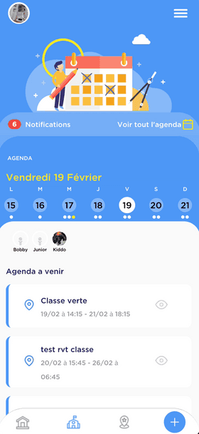
School life - before
School life - after
Design consistency
Pain points
- Design is not consistent throughout the app
- The screens transition in inconsistent directions
Solution
The inconsistencies in the design and transitions between screens were fixed in Adobe XD:
- by creating a design system: colors, character styles, iconography, graphics and even layouts created as components were reused throughout the app
- by creating a high-fidelity prototype and setting the appropriate transitions between screens
On a social app, the more the merrier!
Pain point
The users can share a link to download the app with other parents but cannot directly invite other parents to join a classroom they created in the app.
Solution
Other parents can now join and use the app with an invitation code:
- A user can create a classroom for their children and share the classroom code with other parents.
- A user can also create a family (composed of other people not yet users of the app and children) and share a family code with those people who can then join directly.
Invite a parent to join the family
Responsive design
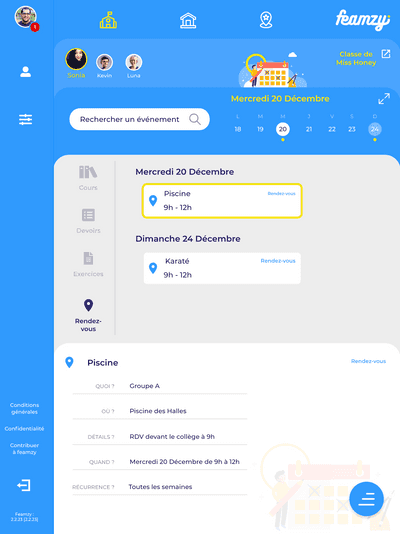
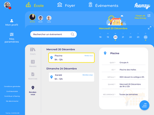
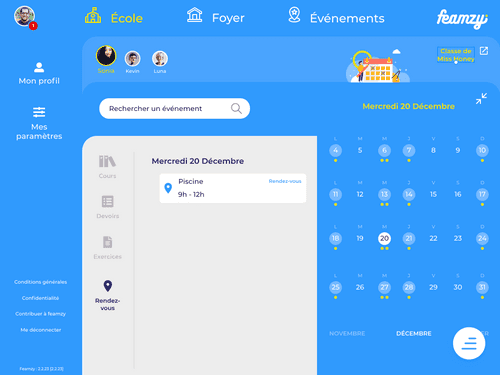
I also worked on porting the design of the app to tablets and desktops in order for the users to be able to interact with the app throughout their day and with the device that is best suited for the task at hand (checking messages of parents on a smartphone is great but browsing homeworks is easier on a tablet for instance).
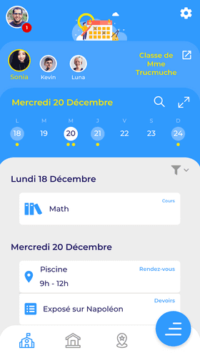
Responsive design doesn't only mean that the size of the elements must vary according to the size of the device. It also means rearranging the elements to take advantage of the device size and how people interact with the device (1 thumb, 2 thumbs, index finger, tap or slide, etc).
School life (mobile)
School life (tablet - horizontal orientation)
School life (tablet - vertical orientation)
School life with calendar (tablet - vertical orientation)
Code
Along with coding new features and fixing bugs, a big part of my work was also improving the existing code: starting from Angular pages, I identified the parts that were duplicated, extracted them and adapted them into Angular components that could then be reused.
In the same way, along with working on a design system in Adobe XD, I refactored all the styles and structured them into a 7-1 pattern architecture. This had the advantages to reduce significantly the number of lines of code, to make the style consistent throughout the app, and to ease maintenance and speed up changes!
Reflection
My work with feamzy was my first ever professional experience being a UX Designer and Front-End Developer and I loved it so much!
Wearing 2 different hats is challenging and context switching always leads to an overhead so I organized my work and split my time as to only work on some UX design topics or on the code at any given time but not on both simultaneously. I know this organization works for me.
Collaboration with the feamzy team worked great as well: working remotely requires additional care in the way we communicate things, share information or feedback. One thing that worked well was recording videos of me interacting with prototypes or presenting something and posting them on Slack. With the timezone difference, they had time to watch, reflect and provide feedback on their mornings in Tunisia and France and by the time I started my morning in the USA, I had all the feedback I needed to continue my work.
I also made sure to secure my time in the mornings to interact with them, be available for questions or meetings. In the same way, I reviewed the things that required an asynchronous feedback from me in my afternoons so they could have all they needed to continue their work on their next day.
I learned so much with feamzy! I also built up experience and confidence along the way. As I write these lines, the version of the app with the onboarding chatbot has just been published. It's too early to tell if the number of active users will increase but time and user testing will tell!
