Covivre
Role:
UX Designer
Duration:
2 months
October 2020 - November 2020
Tools:
Adobe XD/After Effects, Zeplin
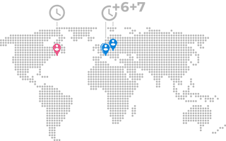
Team: 4 people, 3 timezones
Helping people keep their family, friends and community safe
This project was born during the COVID-19 pandemic as a mean to help fight the spread of the virus with people's privacy and health confidentiality in mind.
I joined a team of 3: 1 Product Manager and 1 Senior Graphic Designer based in France, and 1 Senior Software Developer based in Ukraine.
Problem
In 2020, as the pandemic hit, a lot of people had to cope with anxiety, fear, and sadly with grief too, left alone with the feeling that they had lost control over their life.
Concerns about privacy also arose when governments pushed for the use of their official contact-tracing apps.
Challenge
Design an app that empowers people and gives them the means to take back control over their life but also over their personal information, and fight the virus.
Problem statement
Our target users are people who value their data privacy and who need to be aware of their exposure to COVID-19 because they want to help their family, friends and community stay safe.
Design
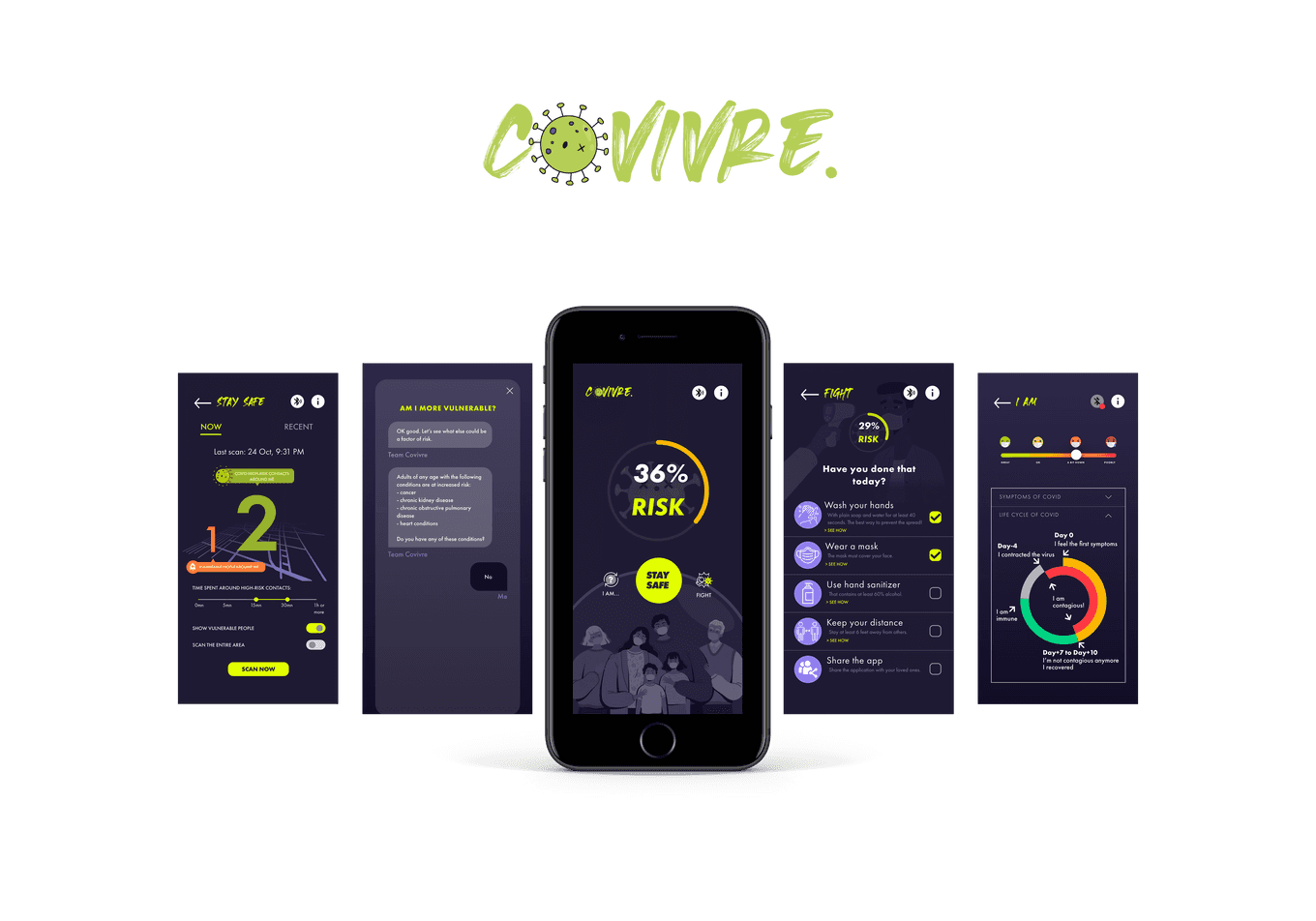
The chosen solution is purely based on Bluetooth with no location tracking and no exchange of personal information. Also, it relies exclusively on the fact that the user would update their status in the app should they test positive.
Main features include:
- Health monitoring
- Best practices checklist
- Exposure level
- Blog
Some feedback gathered on the prototype showed that an onboarding process was needed. An informative section with lenghty text was also replaced with a chatbot whose sequential nature was way more helpful to the users. They felt more guided and they could better process the information because it was split into smaller chunks.
Health monitoring
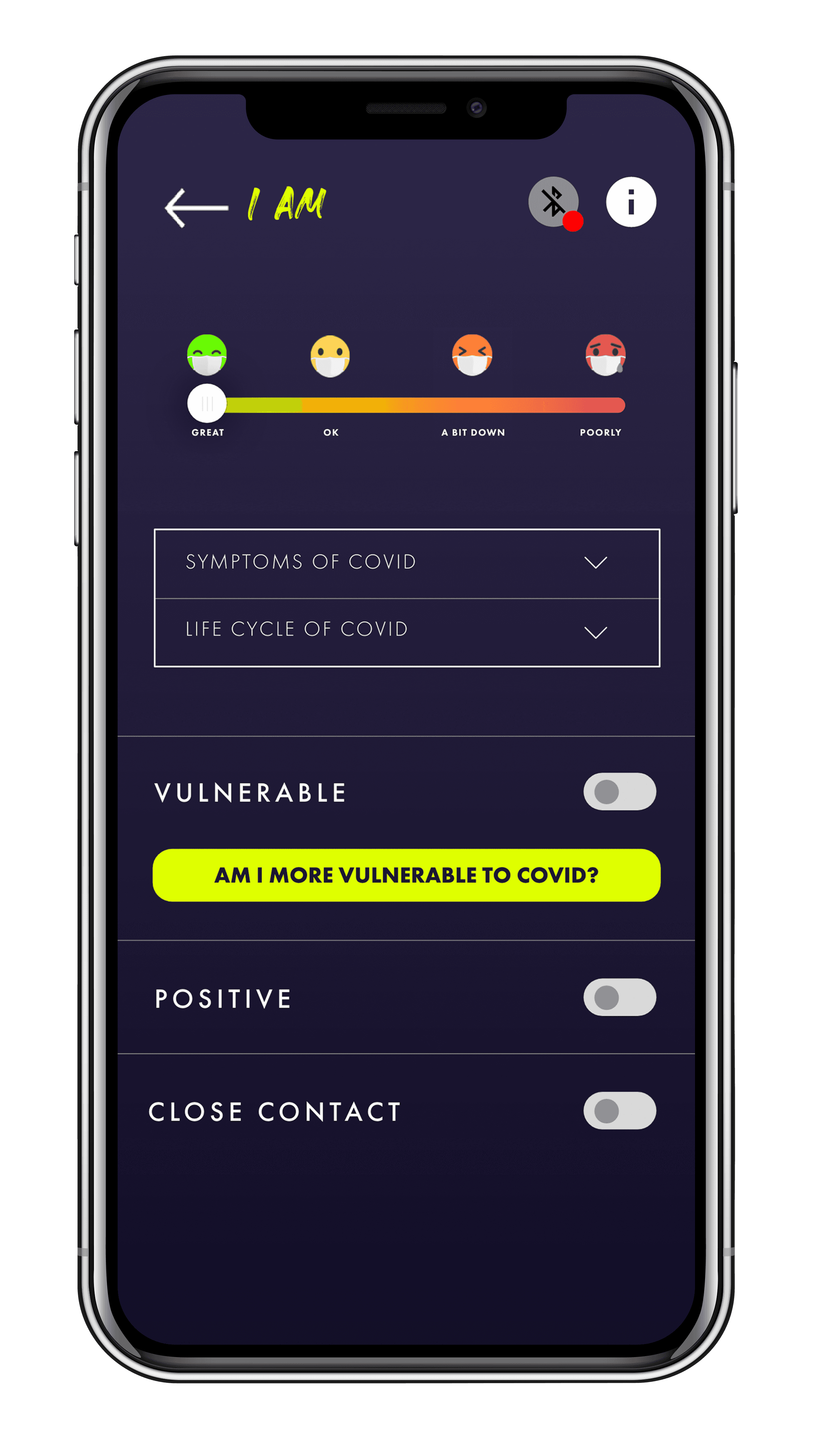
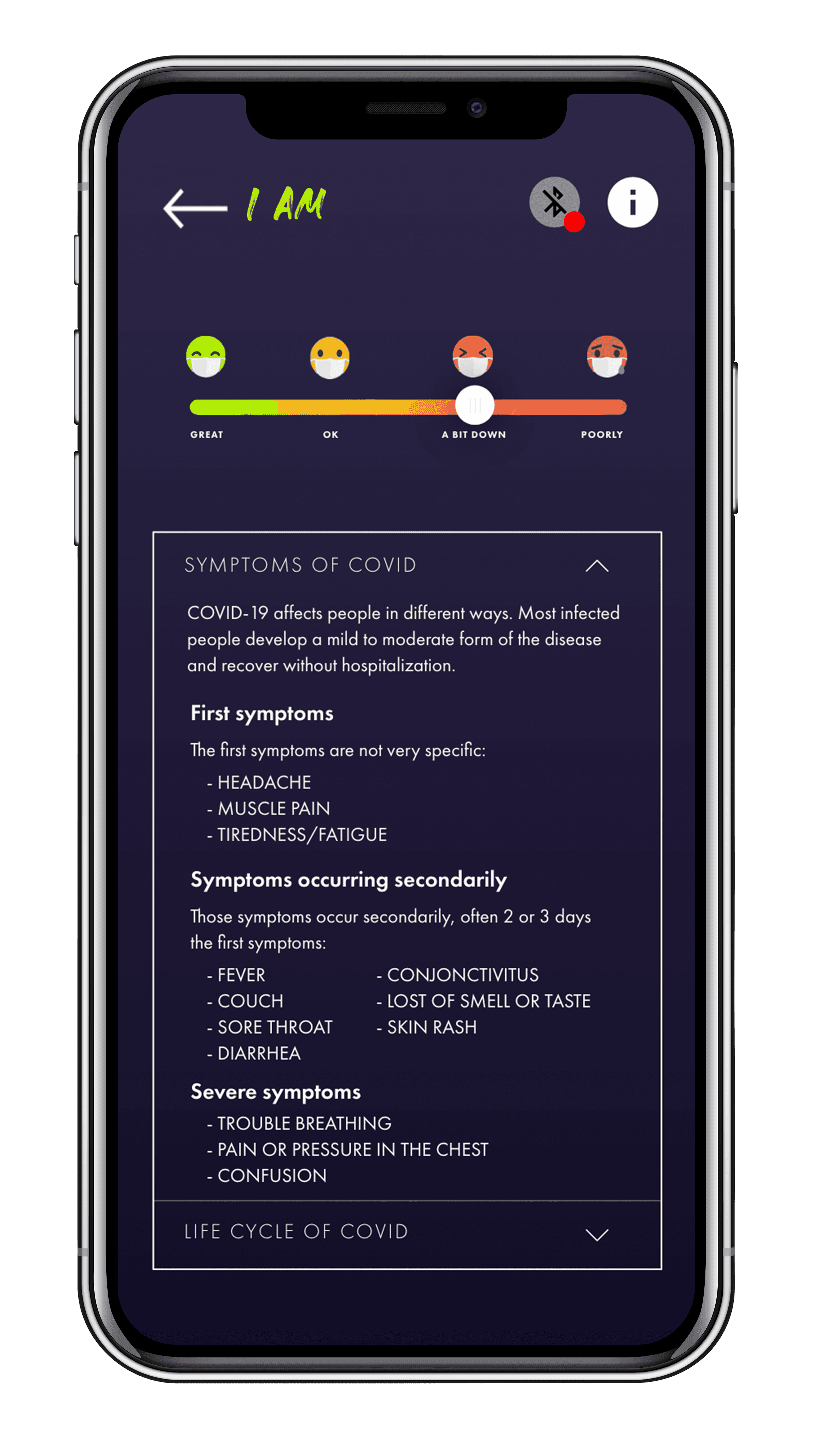
For the users to always be aware of their health and of their potential symptoms, day after day.
Users can log how they feel, day after day
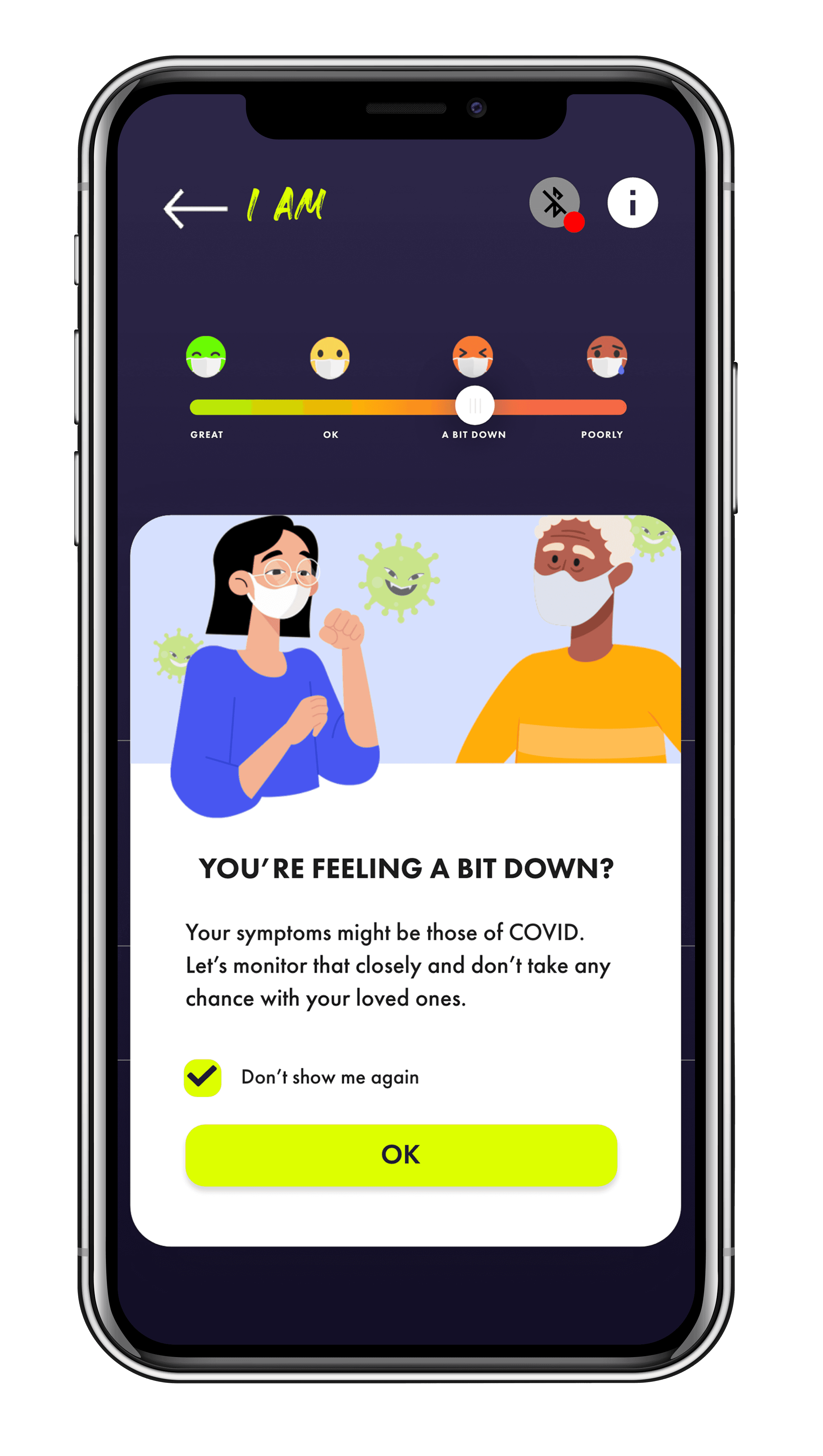
The feature helps increase awareness of current health
Users can check their symptoms and take an informed decision about staying home or not
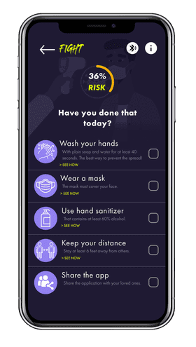
Best practices checklist
A checklist of best practices for fighting the virus with actions that save lives (social distancing, mask wearing, etc).
Users are reminded of the best practices that save lives
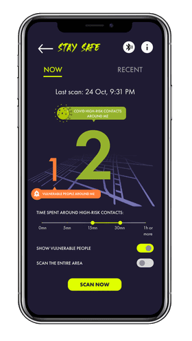
Exposure level
For assessing one's recent or current exposure to COVID-19.
Apps installed on users' phones rely on Bluetooth to exchange information anonymously and determine exposure
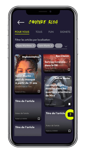
Blog
For checking the local or more distant news and staying informed.
Users can filter news or articles by location and bookmark interesting articles
Outcome
The app didn't end up being developed but a version of a high-fidelity prototype was published in Adobe XD, along with the assets and specifications in Zeplin.
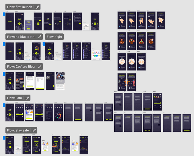
Mockups and high-fidelity prototype in Adobe XD
Here are some recordings of a user going through the main features of the app.
Onboarding on First Launch
Health Monitoring
Best Practices
Exposure to COVID-19
Reflection
I learned a lot about Adobe XD with this project. The importance of using components, colors and character styles to speed up changes on all screens.
Back then - I'm ashamed to say - I had not yet been exposed to all the great tools that a UX designer has at their disposal. If I had to work on this project again today, I would have conducted user interviews and performed a competitive audit. Wireframing would have saved me a lot of time and efforts spent instead on updating the mockups...
If time had permitted, I would have conducted more rounds of usability tests as well and tested each feature thoroughly.
As I write these lines, almost one year later (one year?!), the pandemic is still very much present even if progress has been made. I was pleasantly surprised to learn about Apple and Google's Exposure Notifications which rely on the same principle and I hope it will have a real positive impact.
